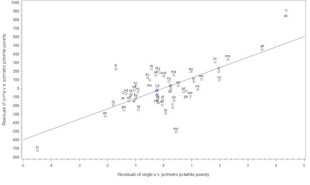
If a linear regression has only a single independent variable (IV), then scatter plot is enough to show the relation between IV and DV (dependent variable). However, if it's multiple regression, although we can drat scatter plot of DV with each IV, it's not enough since it doesn't take into account of the effect of other IV in the model.
A partial regression plot attempts to show the effect of adding an additional variable to the model given that one or more independent variables are already in the model. It's also called added variable plots.
Partial Regression Plot can be formed in these 3 steps:
1: Compute the residuals in the regression of DV against all IVs except X_i;
2: Compute the residuals in the regression of X_i against the remaining IVs;
3: Plot the residuals in 1 v.s. the residuals in 2
Velleman and Welsch list the following useful properties for this plot:
- The least squares linear fit to this plot has the slope Betai and intercept zero.
- The residuals from the least squares linear fit to this plot are identical to the residuals from the least squares fit of the original model (Y against all the independent variables including X_i).
- The influences of individual data values on the estimation of a coefficient are easy to see in this plot.
- It is easy to see many kinds of failures of the model or violations of the underlying assumptions (nonlinearity, heteroscedasticity, unusual patterns).
Implement in SAS:
Here I use the dataset called crime. The regression model is crime ~ pctmetro pctwhite poverty single.
The first way to drat the added variable plot is to use partial options in SAS. That is:
proc reg data=sasreg.crime;
model crime = pctmetro pctwhite poverty single / partial ;
output
run;
quit;
However, if you draw the graph in this way, it is generated in SAS output. The graph is difficult to read and use.
The second way to draw is from our introduction above. We calculate the residuals from the regression, then drat the graph handily.
/* Added Variable Plot*/
/* Calculate Regression Residuals Seperately */
proc reg data=sasreg.crime;
model crime = pctmetro pctwhite poverty ;
output out=result1 r=rcrime;
model single = pctmetro pctwhite poverty ;
output out=result2 r=rsingle;
run;
quit;
/* Sort the data since we need to merge them */
proc sort data=result1; by crime; run;
proc sort data=result2; by crime; run;
/* Merge the data */
data result;
merge result1 result2;
by crime;
label rcrime="Residuals of crime v.s. pctmetro pctwhite poverty";
label rsingle="Residuals of single v.s. pctmetro pctwhite poverty";
run;
goptions reset=all;
symbol1 pointlabel=("#state") v=circle i=rl c=blue;
axis1 label=(r=0 a=90);
proc gplot data=result;
plot rcrime*rsingle / vaxis=axis1;
run;
quit;
From wiki : Partial regression plots are related to, but distinct from, partial residual plots. Partial regression plots are most commonly used to identify data points with high leverage and influential data points that might not have high leverage. Partial residual plots are most commonly used to identify the nature of the relationship between Y and Xi (given the effect of the other independent variables in the model).

This comment has been removed by the author.
ReplyDeleteThanks for the summary, it's very useful!
ReplyDelete