The original one by SAS is here
UCLA ATS. It focus on how to detect
outliers, leverage and influences before doing any regression.
Here it will be replicated in R.
1: read in data and get summary info:
## since there is no data directly, I will use the spss data file
library(foreign)
read.spss("http://dl.dropbox.com/u/10684315/ucla_reg/crime.sav",to.data.frame=T)->crime
head(crime)
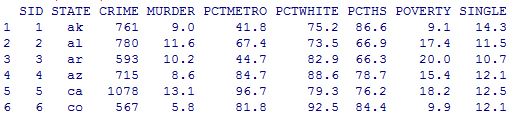
summary(crime)

2: Scatter plot of crime pctmetro poverty and single
names(crime)<-tolower(names(crime))
row.names(crime)<-crime$state
plot(crime[,c("crime","pctmetro","poverty","single")])
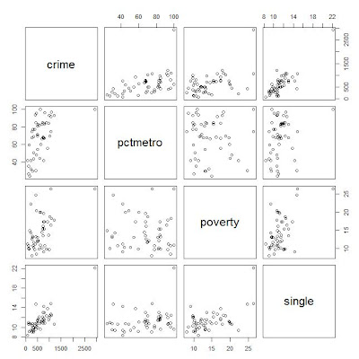
here for convenience, convert the column names from upcase to lowcase.
From the scatter plot, it shows some points are far away from the others.
Outlier: if an independent variable has large residual, then it is an outlier;
Leverage: if an dependent variable(predictor) has an obs far away from the others, then it is called an leverage.
Influence: both outlier and leverage
3: plot of crime vs pctmetro, and label the plot points by another variable
plot(crime$pctmetro,crime$crime)
text(crime$pctmetro,crime$crime,crime$state,cex=.5,pos=2)

From the plot it is clear to see the obs for
DC might be an outlier.
Similarly the plots can be drawn for the other pairs of variables.
4: regression and diaglostics with statistical methods
lm(crime~pctmetro+poverty+single,crime)->crime_reg1
summary(crime_reg1)

The value R square=.8399, which means 83.99% of variation of data are explained by the model. Usually this value > .8 means the model is pretty good.
5: some important values
In statistics class, we have learned some statistics vocabularies like: student residual, leverage(diag of hat matrix), cook's distance and so on. In R it's easy to get them:
## calculate leverage, student residual, and cook's distance

leverage=hatvalues(crime_reg1)
r_std=rstudent(crime_reg1)
cd=sqrt(cooks.distance(crime_reg1))
## plot of leverage vs student residual
plot(r_std^2, leverage)
text(r_std^2,leverage, crime$state, cex=.5, pos=2)

It shows DC and MS have high residuals from the plot. DC has high leverage. So DC should be put more attention.
6: DFBETAS: it's calculated for each obs of all the dependent variables, which meaning how the regression coefficient will change if removing the obs.
head(dfbetas(crime_reg1))

The meaning: take an example for obs AK and var single, if include obs AK in the data, the regression coefficient will be increased by 0.0145*standard_error_of_single_coefficient=.0145*15.5=2.248.
Let's check this:
lm(crime~pctmetro+poverty+single,crime)->crime_reg1
lm(crime~pctmetro+poverty+single,crime[-1,])->crime_reg2
crime_reg1
crime_Reg2

7: Plot all debetas on the same table to compare
data.frame(dfbetas(crime_reg1))->dfb
plot(dfb$single,col="black")
points(dfb$pctmetro,col="green")
points(dfb$poverty,col="red")
text(dfb$single, crime$states,cex=.5,pos=2)

In all, the 51_st point(DC) shall catch our attention.
The possible reason is, all others are data for each state but DC is not a state.
8: Finally is the regression without obs from DC
lm(crime~pctmetro+poverty+single,crime[-51,])->crime_reg3


