Thursday, November 29, 2012

explore data with ggplot2

The purpose here is to explore the relation between variable actrpv(which is the actual value) vs lprpv(which is the descriptive data). We think there should be some relation between these two. Here use the graph to explore it.

cat("\014")
rm(list=ls())
rpvdata<-read.csv("D:\\SkyDrive\\Public\\landing_page_rpv\\landing_page_rpv.csv",header=T, skip=2)
 
head(rpvdata)
names(rpvdata)<-tolower(names(rpvdata))
rpvdata=rpvdata[rpvdata$product_count>0,]
 
sapply(rpvdata, class)
str(rpvdata)
rpvdata$lprpv=rpvdata$projected_rpv
attach(rpvdata)
library(ggplot2)
p<-ggplot(rpvdata, mapping=aes(x=lprpv, y=actrpv))
p+geom_point()+stat_smooth() 
plot(lprpv, actrpv, col="blue", main="plot of lprpv vs actrpv")


It does not show any clear relation between these two variables from the graph above.

To make it a little clear, the data are grouped into 20 groups based on the percentiles of lprpv(5%, 10%, ..., 100%). And calculate t he weighted mean at each group weighted by variable visits_wt. It is shown the average of lprpv and average of actrpv are somehow linear related.

## bucket data into 20 buckets like sas proc rank did
lprpv_rank<-cut(lprpv, breaks=quantile(lprpv, probs=c(0:20/20)), labels=0:19, include.lowest=T, right=F)
table(lprpv_rank)
## calculate mean of lprpv in each lprpv_rank
tapply(lprpv, lprpv_rank, mean)
## calculate weighted mean
library(plyr)
df_wtm<-as.data.frame(cbind(lprpv, actrpv, lprpv_rank, visits_wt))
lprpv_m<-ddply(df_wtm, .(lprpv_rank), function(x) data.frame(lprpv_mean=weighted.mean(x$lprpv, x$visits_wt)))
actrpv_m<-ddply(df_wtm, .(lprpv_rank), function(x) data.frame(actrpv_mean=weighted.mean(x$actrpv, x$visits_wt)))
overall_wt_m<-merge(lprpv_m, actrpv_m, by="lprpv_rank")
## plot of the data with smoothed curve
ggplot(overall_wt_m, aes(x=lprpv_mean, y=actrpv_mean))+geom_point()+stat_smooth()
## linear regression without product_count information
summary(lm(actrpv_mean ~ lprpv_mean, data=overall_wt_m))

From the graph above, it shows a linear relation if we ignore the first several points with low value of lprpv_mean.

The linear regression result is given below. The adjusted R square is about .3936, which means the regression is not good. Usually R^2 > .8 means the regression is good.


Next we involve another variable called product_count, which is the numer of products on each page. If it is 1, means there is only 1 product on that page. In this condition, we should expect lprpv and actrpv are closely related.

### next include prod_cnt_flag in the analysis
## generate flag variables like sas format did
cutf=function(x) cut(x, breaks=quantile(x, probs=c(0:20/20)), labels=0:19, include.lowest=T, right=F)
prod_cnt_flag<-ifelse(product_count==0, 0, ifelse(product_count==1,1,ifelse(product_count==2,2,ifelse(product_count==3,3,4))))
overall_m=list()
for (i in 1:4){
  lprpv_rank<-cut(lprpv[product_count==i], breaks=quantile(lprpv[product_count==i], probs=c(0:20/20)), labels=0:19, include.lowest=T, right=F)
  df_wtm<-as.data.frame(cbind(lprpv=lprpv[product_count==i], actrpv=actrpv[product_count==i], lprpv_rank, visits_wt=visits_wt[product_count==i]))
  lprpv_m<-ddply(df_wtm, .(lprpv_rank), function(x) data.frame(lprpv_mean=weighted.mean(x$lprpv, x$visits_wt)))
  actrpv_m<-ddply(df_wtm, .(lprpv_rank), function(x) data.frame(actrpv_mean=weighted.mean(x$actrpv, x$visits_wt)))
  overall_wt_m<-merge(lprpv_m, actrpv_m, by="lprpv_rank")
  overall_wt_m=data.frame(cbind(overall_wt_m, prod_cnt_group=i))
  overall_m[[i]]=overall_wt_m
}
 
## or plot with ggplot2, concatenate the list to a long data frame
df=as.data.frame(do.call(rbind, overall_m))
library(ggplot2)
p<-ggplot(df, mapping=aes(lprpv_mean, actrpv_mean))
p+geom_point()+stat_smooth()+facet_wrap(~prod_cnt_group, ncol=1)


Now the data in the first group(top one) is more linear then before as is explained. For the other three groups they also linearly perform better than without group condition.

From this study, we should put the variable prod_cnt_group in the regression as a categorival variable. It will help to improve the model fitting.

key point: 1)how to calculate weighted mean 2)how to aggregate in each level of a factor, this can be done by tapply. But here is done by library(plyr). 3)how to draw separately for each factor level in ggplot2 with facet_wrap.

Wednesday, November 28, 2012

R: Replicate plot with ggplot2

The purpose is to replicate theose scatter plot from ucla ats with ggplot2. The original plots from ucla ats is:  Scatter plot

ggplot2 has less to remember than the plot in R base. Generally, it has those important concepts:

1: mapping and scale: mapping the data to plot attributes, like map data to x, y or colour, group and so on.

2: geometric object: plot points, lines, or curves, histogram, bar chart and so on

3: statistics: like regression, smoothing, or statistics

4: coordinate: choose data to show

5: layer and facet: group the data in different plots

Now I will show how to draw the graphs in the website above.


## to replicate: http://www.ats.ucla.edu/stat/r/gbe/scatter.htm
 
rm(list=ls())
cat("\014")
hsb2 <- read.table('http://www.ats.ucla.edu/stat/r/modules/hsb2.csv', header=T, sep=",")
attach(hsb2)
head(hsb2)
str(hsb2)
 
library(ggplot2)
p<-ggplot(hsb2, aes(x=math, y=write))
 
## graph1
p+geom_point()
 
## graph2
p+geom_point()+stat_smooth(method="lm")
 

## graph3_4
p+geom_point(aes(colour=factor(female)))
 
(This graph 3-5 is different from the plots on ucla ats. It looks like there are some issues about their plot since if look at the two bigges math value for male, they are 75. But in their third plot this is lost. I have sent email to them to double check.)
## graph5
ggplot(hsb2, aes(x=math, y=write, colour=factor(female), shape=factor(female))) + geom_point() + geom_smooth(method="lm", fill=NA)


Monday, November 19, 2012

Simulation for An Interview Question

I was asked this question last year, and saw someone post it in misbbs yesterday.

The question is: A and B toss a dice by turns, the person who first gets 6 will win. Now A toss it first. What is the probability of A winning?

The answer should be: P(A)=6/11 and P(B)=5/11. We need to use conditional probability to solve it.

Solution: for first run, if A get 6, prob is 1/6. If A fails, prob is 5/6; then B get 6 is 1/6. So the prob of B win is A fails and B gets 6, which is 5/6*1/6=5/36.

For the second run, both A B fials in the first run, then A get 6, it is 5/6*5/6*1/6. For B, it is 5/6*5/6*5/6*1/6.

And so on.

So final A wins is: 1/6 + 5/6*5/6*1/6 * (5/6*5/6)^2*1/6 +... = (1/6)/(1-5/6*5/6) = 6/11.

Or we can see every time P(A) = 5/6 * P(B) and P(A) + P(B)=1. So P(A)=6/11.

It can be verified by this small program:

### veiry the dice toss question

rm(list=ls())
cat("\014")

rec=rep(-1,1000000)

for (jj in 1:1000000){
s=sample(6,1)
i=1
while (s != 6){
  s=sample(6,1)
  i=i+1
}
  rec[jj]=i
}

sum(rec %% 2 ==1)/1000000

The result is 0.545172 which is close to 6/11=0.5454545.


Saturday, November 10, 2012

R: linear regression diagnostic -- 1: Outlieers, Leverage and Influence data detect

The original one by SAS is here UCLA ATS. It focus on how to detect outliers, leverage and influences before doing any regression.

Here it will be replicated in R.

1: read in data and get summary info:

## since there is no data directly, I will use the spss data file 
library(foreign)
read.spss("http://dl.dropbox.com/u/10684315/ucla_reg/crime.sav",to.data.frame=T)->crime
head(crime)

summary(crime)


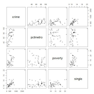
2: Scatter plot of crime pctmetro poverty and single

names(crime)<-tolower(names(crime))
row.names(crime)<-crime$state
plot(crime[,c("crime","pctmetro","poverty","single")])


here for convenience, convert the column names from upcase to lowcase.

From the scatter plot, it shows some points are far away from the others.

Outlier: if an independent variable has large residual, then it is an outlier;
Leverage: if an dependent variable(predictor) has an obs far away from the others, then it is called an leverage.
Influence: both outlier and leverage

3: plot of crime vs pctmetro, and label the plot points by another variable


plot(crime$pctmetro,crime$crime)
text(crime$pctmetro,crime$crime,crime$state,cex=.5,pos=2)


From the plot it is clear to see the obs for DC might be an outlier.

Similarly the plots can be drawn for the other pairs of variables.

4: regression and diaglostics with statistical methods


lm(crime~pctmetro+poverty+single,crime)->crime_reg1
summary(crime_reg1)


The value R square=.8399, which means 83.99% of variation of data are explained by the model. Usually this value > .8 means the model is pretty good.

5: some important values

In statistics class, we have learned some statistics vocabularies like: student residual, leverage(diag of hat matrix), cook's distance and so on. In R it's easy to get them:

## calculate leverage, student residual, and cook's distance

leverage=hatvalues(crime_reg1)
r_std=rstudent(crime_reg1)
cd=sqrt(cooks.distance(crime_reg1))


## plot of leverage vs student residual
plot(r_std^2, leverage)
text(r_std^2,leverage, crime$state, cex=.5, pos=2)


It shows DC and MS have high residuals from the plot. DC has high leverage. So DC should be put more attention.

6: DFBETAS: it's calculated for each obs of all the dependent variables, which meaning how the regression coefficient will change if removing the obs.

head(dfbetas(crime_reg1))


The meaning: take an example for obs AK and var single, if include obs AK in the data, the regression coefficient will be increased by 0.0145*standard_error_of_single_coefficient=.0145*15.5=2.248.

Let's check this:

lm(crime~pctmetro+poverty+single,crime)->crime_reg1
lm(crime~pctmetro+poverty+single,crime[-1,])->crime_reg2
crime_reg1
crime_Reg2


7: Plot all debetas on the same table to compare

data.frame(dfbetas(crime_reg1))->dfb
plot(dfb$single,col="black")
points(dfb$pctmetro,col="green")
points(dfb$poverty,col="red")
text(dfb$single, crime$states,cex=.5,pos=2)


In all, the 51_st point(DC) shall catch our attention.

The possible reason is, all others are data for each state but DC is not a state.

8: Finally is the regression without obs from DC

lm(crime~pctmetro+poverty+single,crime[-51,])->crime_reg3


Monday, November 5, 2012

R: how to draw added-variable plot (partial-regression plot)

Partial regression is very helpful in detecting influential points in multiple regression.  The one in SAS and introducion of added variable plot is here:

http://www.songhuiming.com/2011/10/sas-how-to-draw-added-variable-plot.html


Here is how to do it in R with library(car):

library(foreign)
read.spss("http://dl.dropbox.com/u/10684315/ucla_reg/crime.sav",to.data.frame=T)->crime

head(crime)

## change upcase column names to lowcase
names(crime)<-tolower(names(crime))
row.names(crime)<-crime$state

lm(crime~pctmetro+pctwhite+poverty+single,crime)->crime_reg1
summary(crime_reg1)

library(car)
avPlots(crime_reg1,"single",labels=row.names(crime),id.method=cooks.distance(crime_reg1),id.n=51)


The output graph is given below. It is the graph of residuals of crime vs residuals of single while both crime and single are adjusted by the other variables(pctmetro+pctwhite+poverty). From the graph it shows DC should be taken care of. AK and WV are also the points that may be influential points.